Map workspace for site power
Geoforge
2025–2026
- Role
- App product design, data-viz, front-end build
- Timeline
- 2025–2026
- Platform
- Web app · Public launch site (reports)
- Stack
- Figma · MapLibre · HTML · CSS · JS
“This whole thing is awesome, especially the blank state. Great across the board. Overall I'm really pleased with the direction of the design, it's bright and clean and clear.”
Client · Geoforge
Live product
geoforge.aiDesigned the app and the launch site, then vibe-coded the launch site to production myself. Final calls on look-and-feel are the client's.
Geoforge screens land for data centers. The hardest question on any site is whether it can get power, and that answer used to take a consultant weeks and thousands of dollars. Geoforge gives it back the same day, sourced. I designed the map workspace and the team side of the app, then designed and built the free launch site that delivers the report.
Overview
Power is the bottleneck for data centers, and checking it is expert work that takes weeks. Geoforge makes that check free and fast. Drop a location, get a report with a verdict on each part of the power picture. Two surfaces: the collaborative map app where teams keep their sites, and the public launch site that turns any pin into a shareable report.
Same day
vs weeks for a consultant power study
9
power criteria, each sourced
21,000+
points of interconnection modeled
$0
to run a report, work email only
The problem
Screening a site for power means pulling together interconnection capacity, the queue, historical pricing, nearby generation and transmission, and time-to-power. Developers, landowners and brokers pay consultants weeks and thousands for that read. Most dead sites don't get killed until late, after money has already gone into them.
The data behind it all is dense and easy to argue with. The instinct is to boil it down to one overall score, but a single blended number just moves the argument somewhere else. The design problem was making a lot of technical grid data trustworthy to non-experts without hiding the parts that matter.
The solution
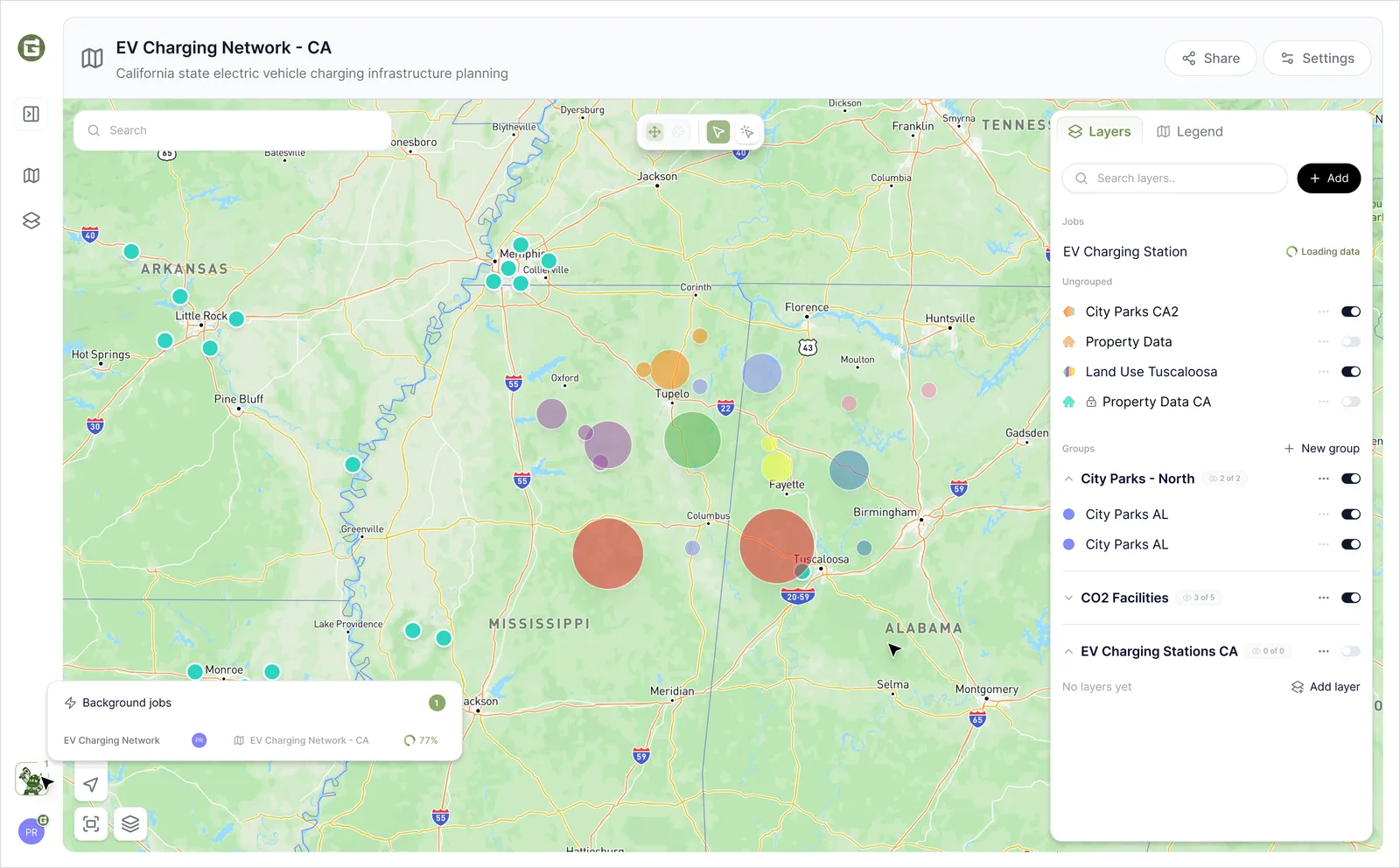
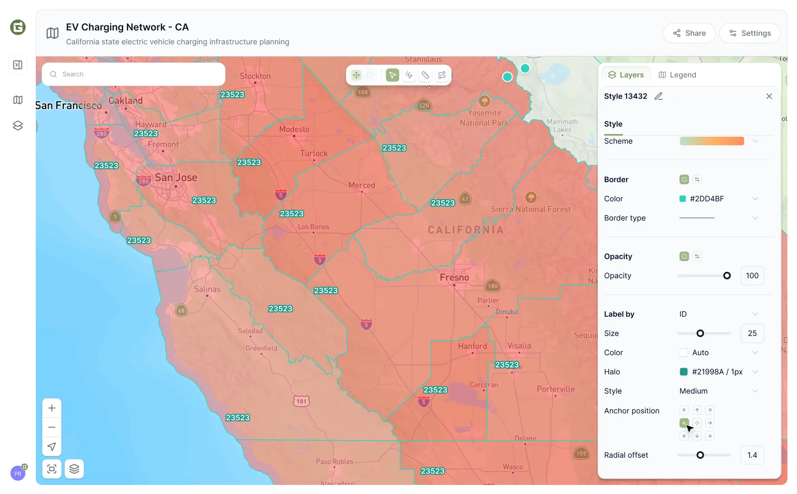
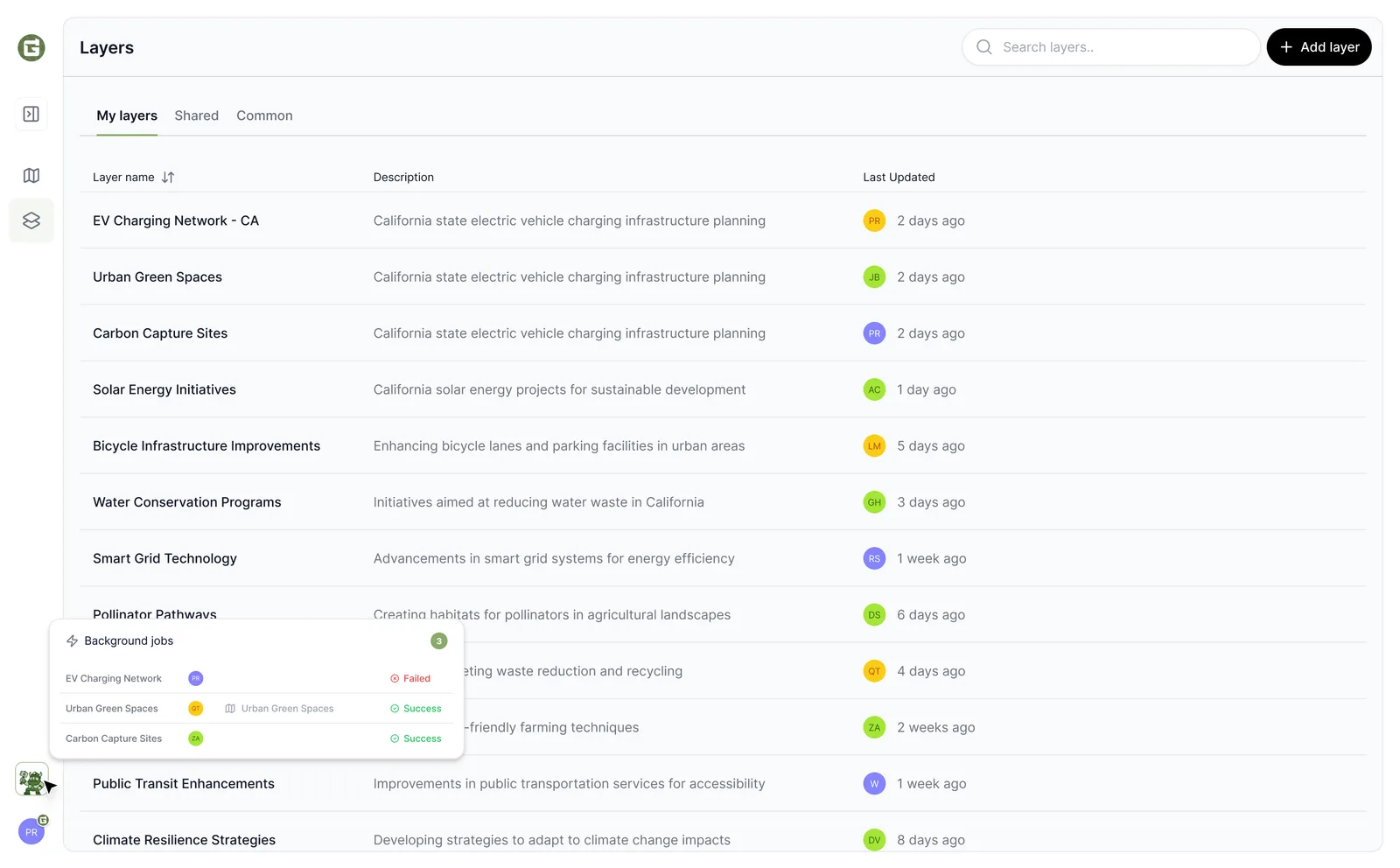
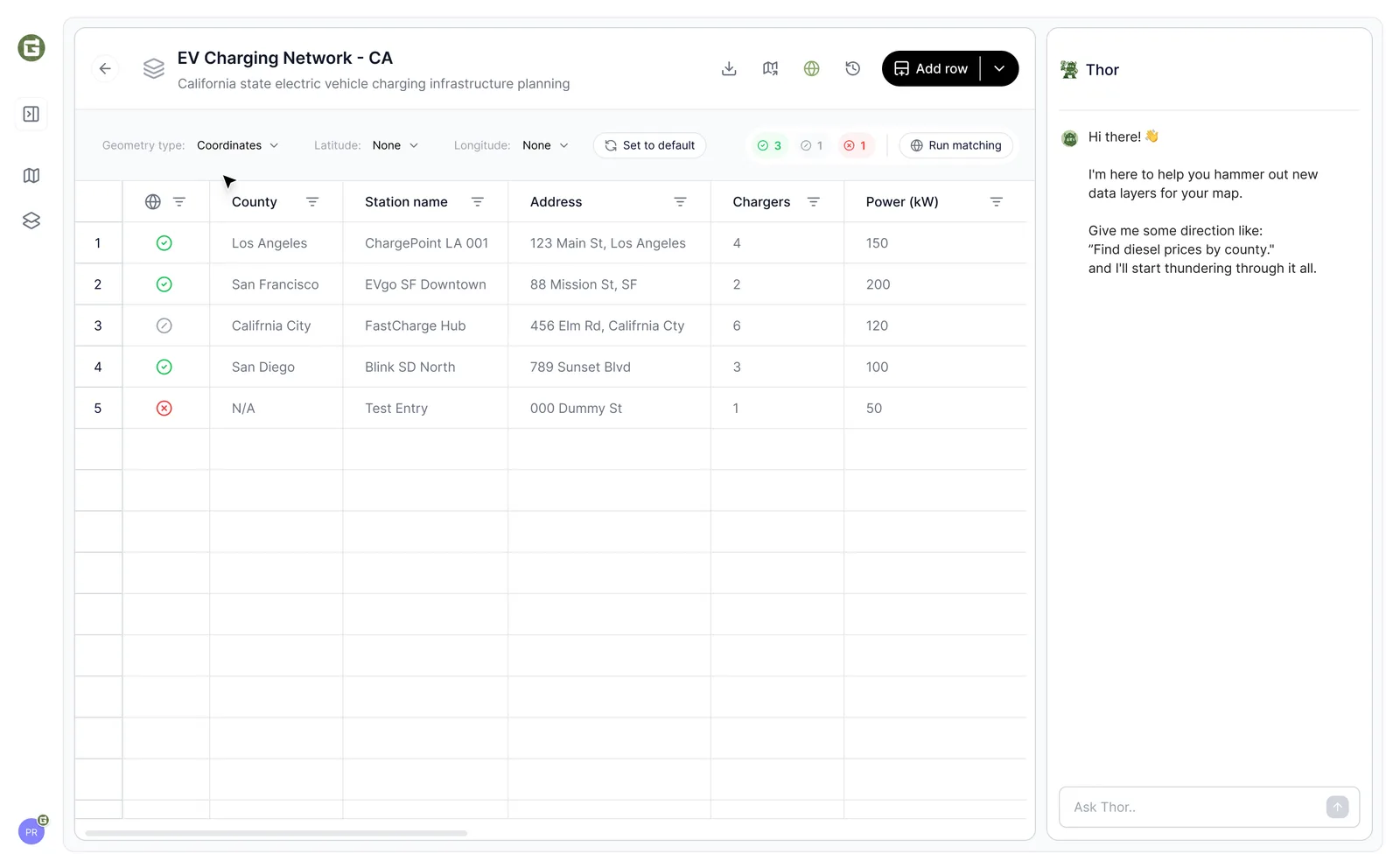
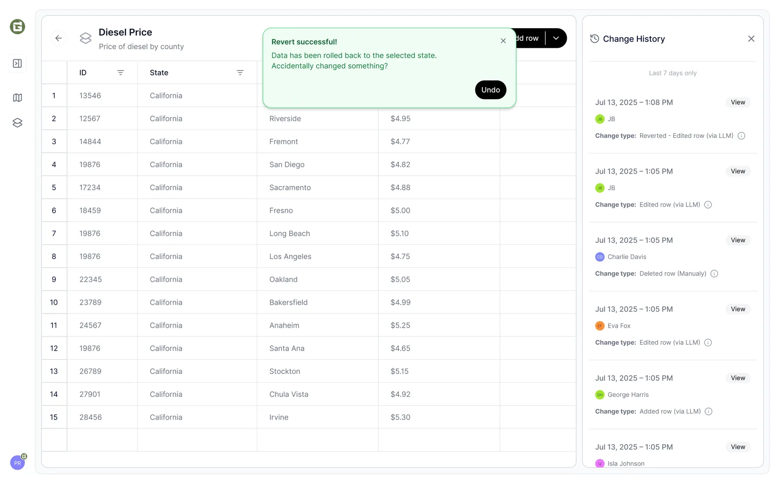
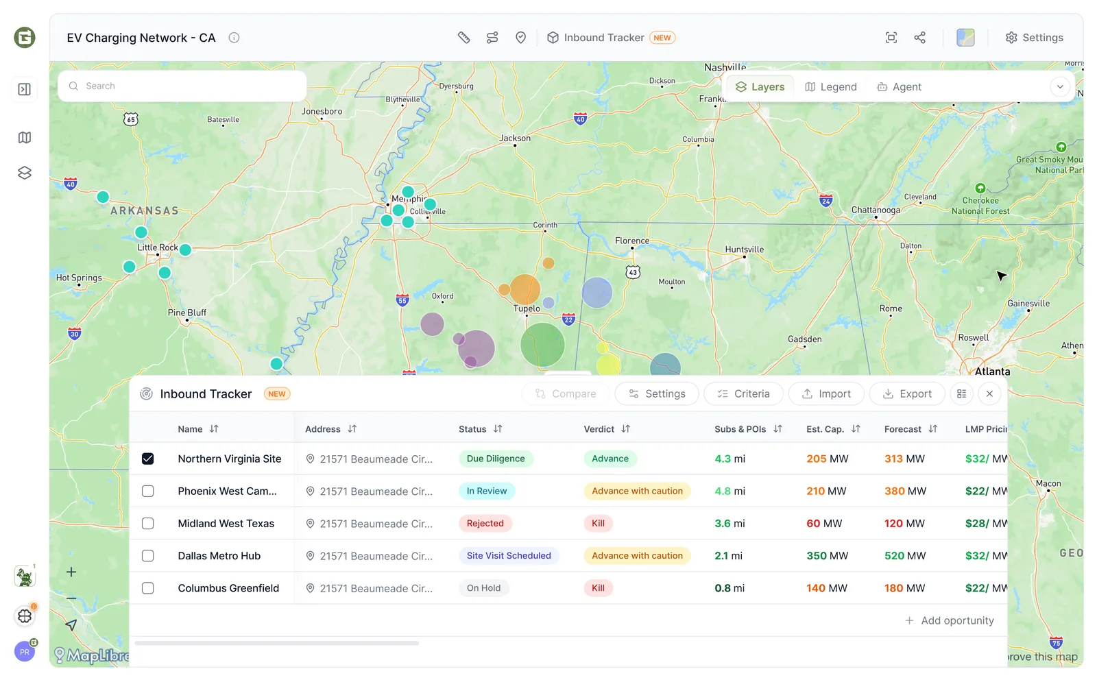
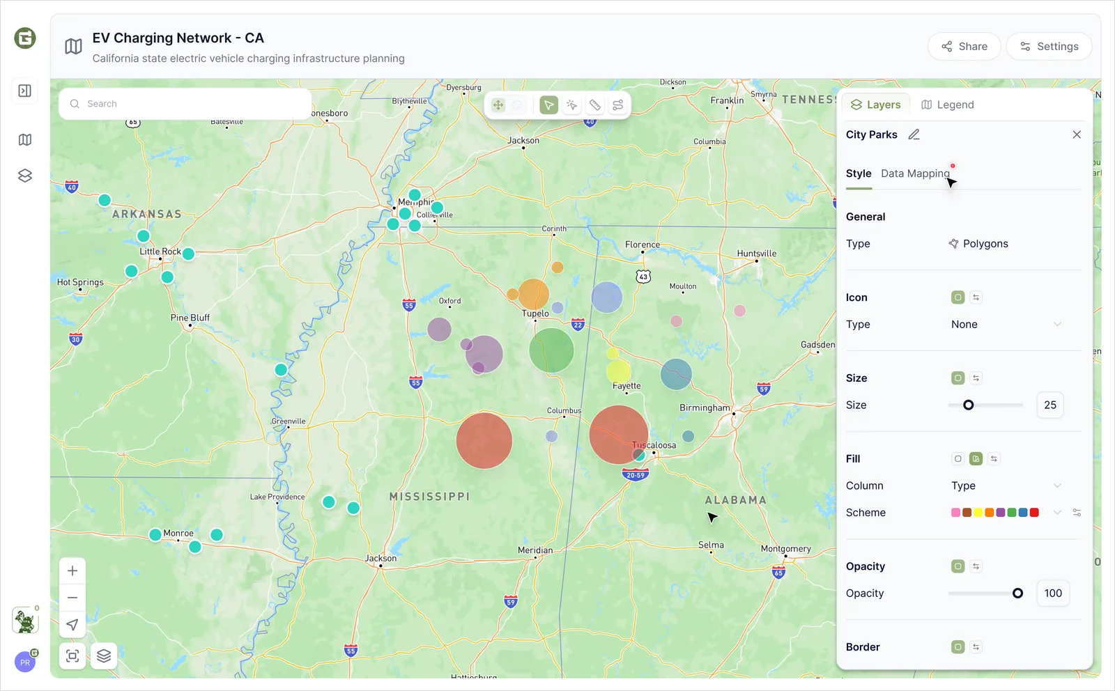
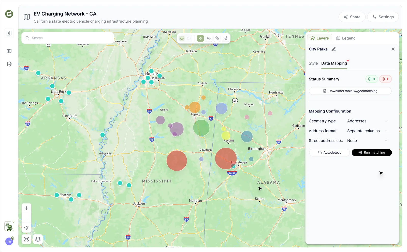
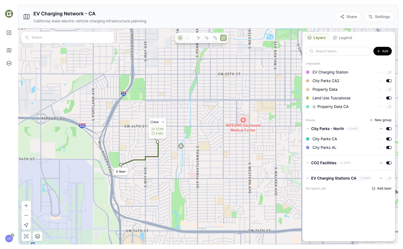
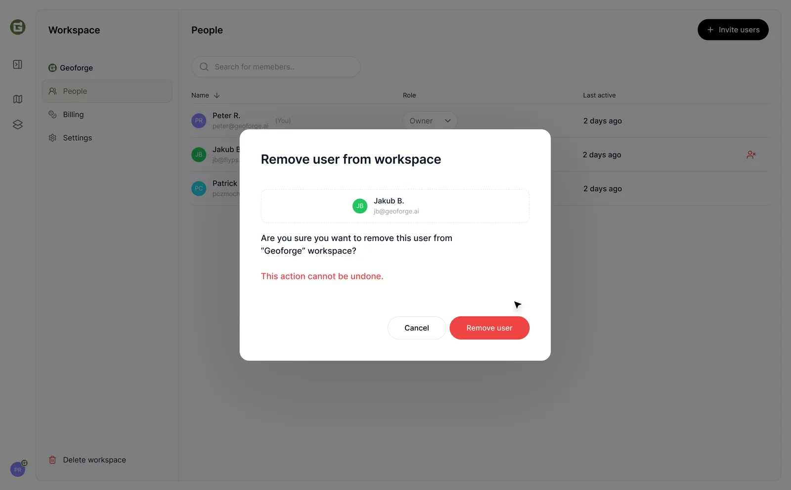
On the app side I designed the map workspace: a My Maps gallery where teams keep location datasets like grid capacity or candidate sites, plus everything around it (roles, invitations, settings, account). Deliberately light and quiet, so the maps and the data do the talking.
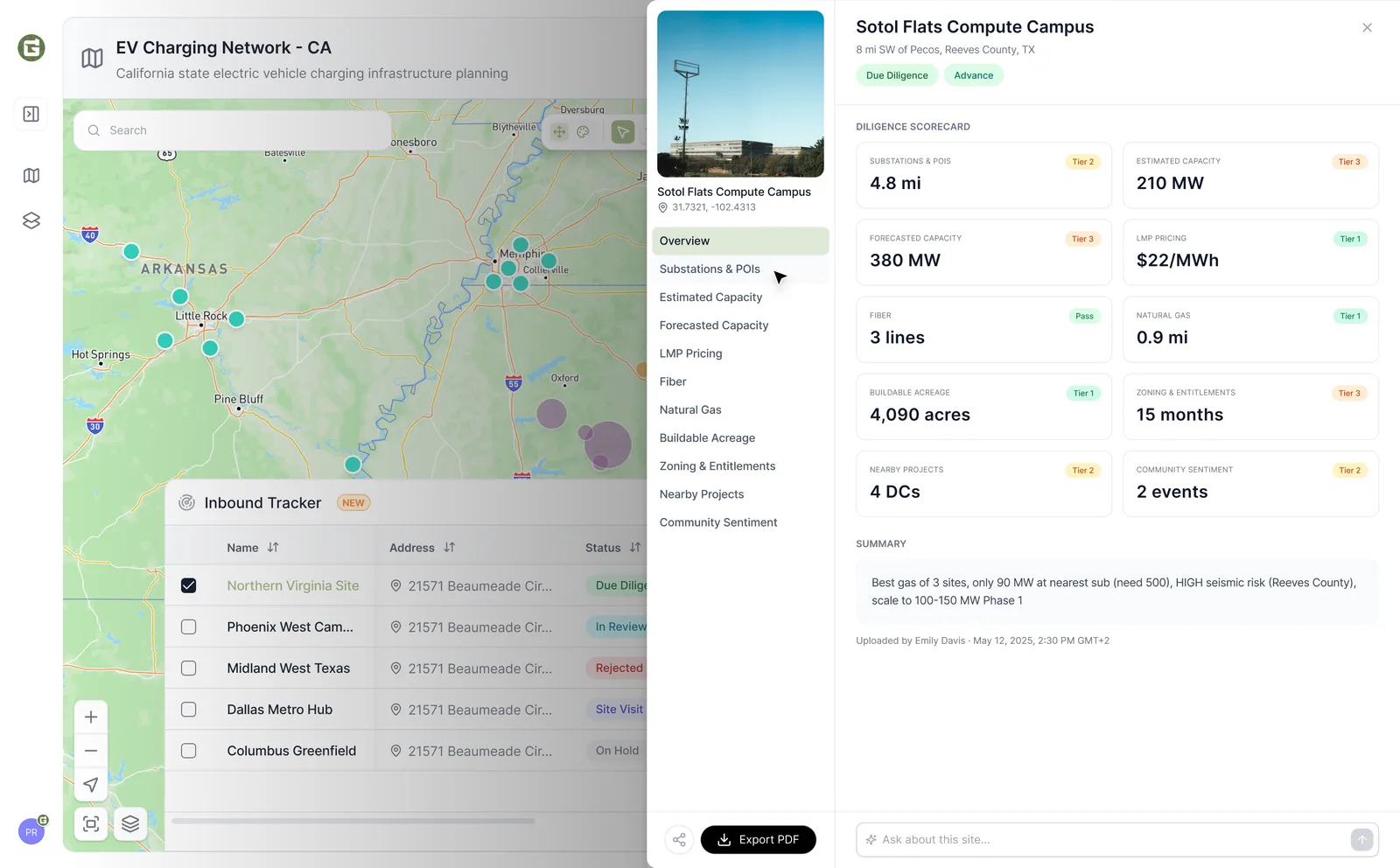
For the launch site the team made a call I still stand by: no blended score. Each report covers nine power criteria, and every one stands on its own with a verdict (pass, tier one, tier two or fail), the headline number and a sourced read behind it. Then I built the site myself: a self-contained page with live maps that anyone can run with a work email and share on its own link.
Screens and flows
What I designed
Map workspace
A My Maps gallery of location datasets with search, roles and sharing. A team's sites live in one place.
Nine-criteria power report
One verdict per criterion instead of one blended score. Each backed by a headline stat and a sourced read a non-expert can follow.
Trust through sourcing
Every figure traces back to grid and market records, modeled the way grid operators model it. The report holds up in a real conversation.
Designed and shipped
I designed the launch site and built it in code: a shareable web report with live maps, private to each account by default.
Keywords
Next project
Zest · Product for AI team analytics